
Choosing a paint color often seems simple until it’s on the wall. Many homeowners are surprised that a color they loved on a sample card looks completely different in their home. That difference is almost always lighting. Natural light, artificial light, room direction and time of day all change how paint colors look. Understanding how light interacts with paint can prevent costly mistakes and help you pick colors you’ll be happy with for years.
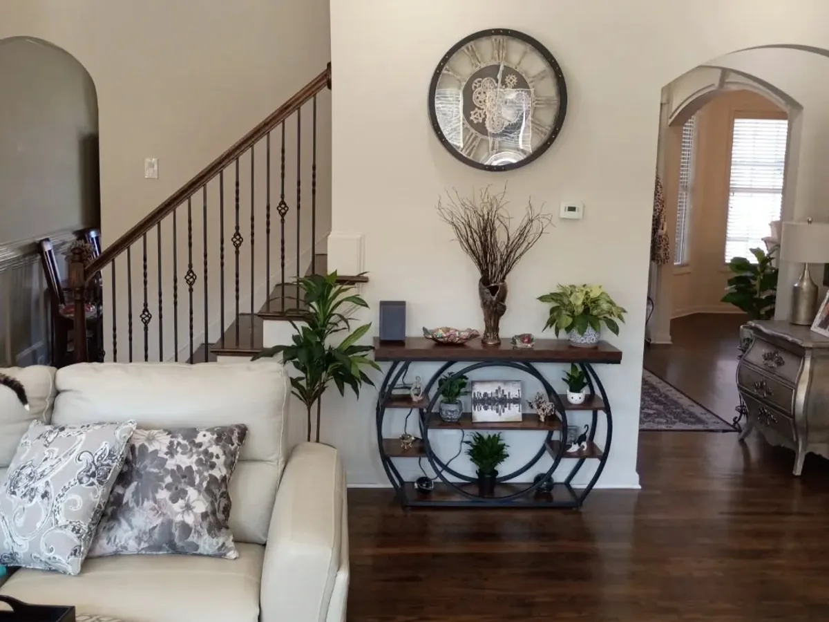
Paint color changes throughout the day
Paint color isn’t static. Morning light is typically cooler and softer, midday light is brighter and more neutral, and evening light is warmer and deeper. A color that looks clean and crisp at noon may feel dull or overly warm at night. That’s why it’s important to look at paint samples at several times of day before deciding.
Which way does the room face?
North-facing rooms get cooler, more consistent light, which can make colors feel muted or slightly gray. Warmer tones such as soft creams and warm grays often balance these rooms.
South-facing rooms get strong, warm light for most of the day, so colors look brighter and more vibrant. Cooler tones can keep these rooms from feeling too yellow, although most colors perform well.
East-facing rooms get bright, warm light in the morning that turns cooler as the day goes on. That can cause noticeable color shifts from morning to afternoon, so balanced neutrals are a safer choice unless you test thoroughly.
West-facing rooms have softer daylight early and strong, warm light in the evening. Colors may look neutral during the day and much richer at sunset, which can intensify warm colors and make cool tones feel harsh at night.
Artificial lighting matters too
Artificial light has a big impact on color, especially in the evening. Warm bulbs bring out reds, yellows and warm neutrals, while cooler daylight bulbs emphasize blues, greens and grays. Homes with mixed lighting can see uneven color from wall to wall, so always judge samples under the lighting you use most in that room.
Why sample cards aren’t enough
Sample cards are useful for narrowing options, but they’re too small to show undertones accurately and don’t reflect your room’s light. Once paint is on the wall and surrounded by trim, flooring and furniture, it can look quite different. Painting larger samples on several walls and watching them over a few days gives a much clearer picture.
Common color mistakes
The most common mistakes are choosing colors only under store lighting, ignoring undertones, matching paint to temporary furnishings instead of permanent features, and rushing the decision. Paint is one of the most visible finishes in a home, so it’s worth taking the time to test carefully.
How a professional painter helps
An experienced painting contractor understands how colors behave in real rooms. We can help spot undertones, suggest colors that hold up in changing light, recommend durable finishes and steer you away from trends that may not age well. At Wheeler Painting, we talk through colors at the walkthrough and confirm the Sherwin-Williams color name and number with you before paint is ordered. The finish matters too; see our guide to paint sheens.
Final thoughts
Choosing the right color isn’t just personal preference. It’s about understanding light, space and timing. When you consider how a room’s light changes through the day, you can choose colors that look good all the time, not just under ideal conditions. If you’re planning an interior repaint and still aren’t sure, testing and professional guidance make all the difference.
Restored from our original Painting Tips article.